How to easily boost the readability of your
- proposals
- decks
- site
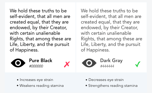
Avoid pure black text against an all white back ground

Why does this work?
- The contrast of pure black and white is too sharp
- It’s harder on the eyes – harder to absorb
- A little gray goes a long way
Simple fix:
- Use dark gray
Hope this helps!
Source: ux movement